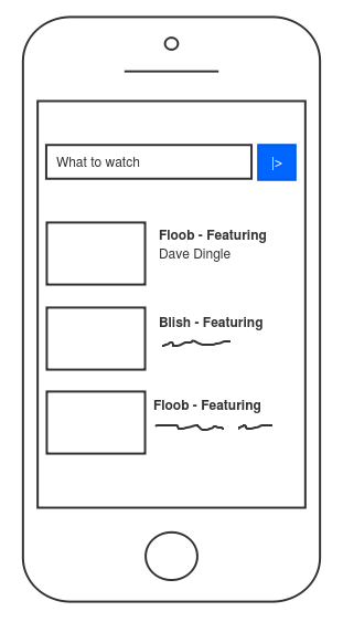
We are happy to introduce new shapes. Most of users requested new shapes in the Sketchboard survey. Clear trend of the survey was to be able to create better looking content with version control. So that’s what we are working on. First features to roll out are new shapes and move elements to foreground/background.
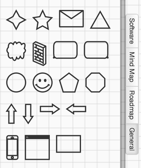
Now Sketchboard provides generic shapes category. Feature would not have worked out very well without move elements to foreground/background, so that is implemented as well. Library on the right hand side of the board lists generic shapes.
Have more variety to distinguish shapes from each other, without the shapes being too realistic. Still keeping the sketchiness.
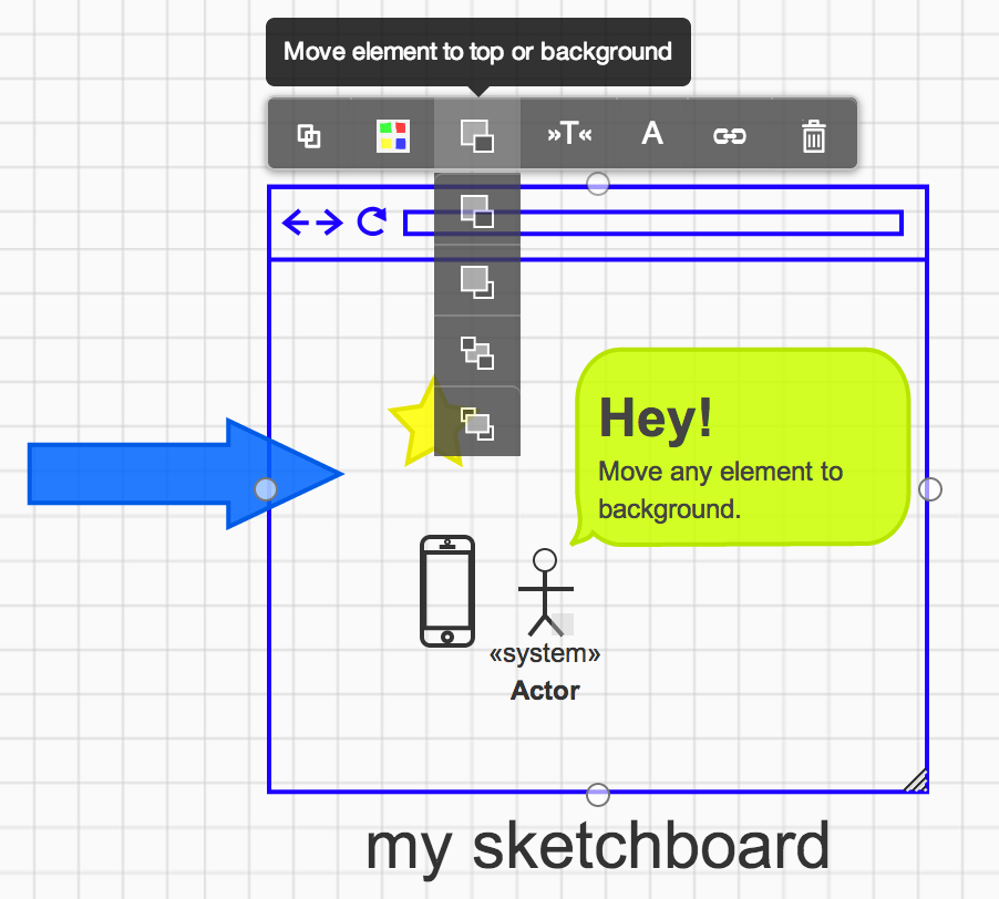
Move elements to foreground/background
Sketchboard’s original idea was to always “layer” shapes correctly. This however didn’t worked out as planned, since there are various different kind of users and ways to use Sketchboard. Users wanted to move elements to foreground and background, to have more control how to lay down elements on a board.
NOTE Sketchboard still uses “automatic” layers:
- Top layer: arrows layer
- Middle layer: elements layer
- these elements can be reordered
- Bottom layer: container layer
- vertical and horizontal partitions, package
Board Context Menu
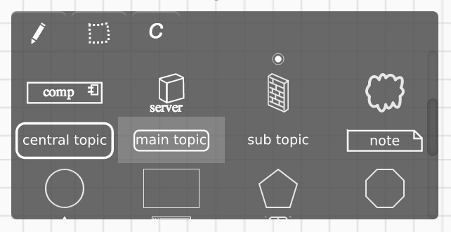
Board context menu is changed and now you can connect any element with each other. In addition to that, this is the default board context menu as well. Double click or long press (on iPad) empty area of the board and you can create any element on that place. Scroll up or down to find other elements.
Example usages
Network diagram
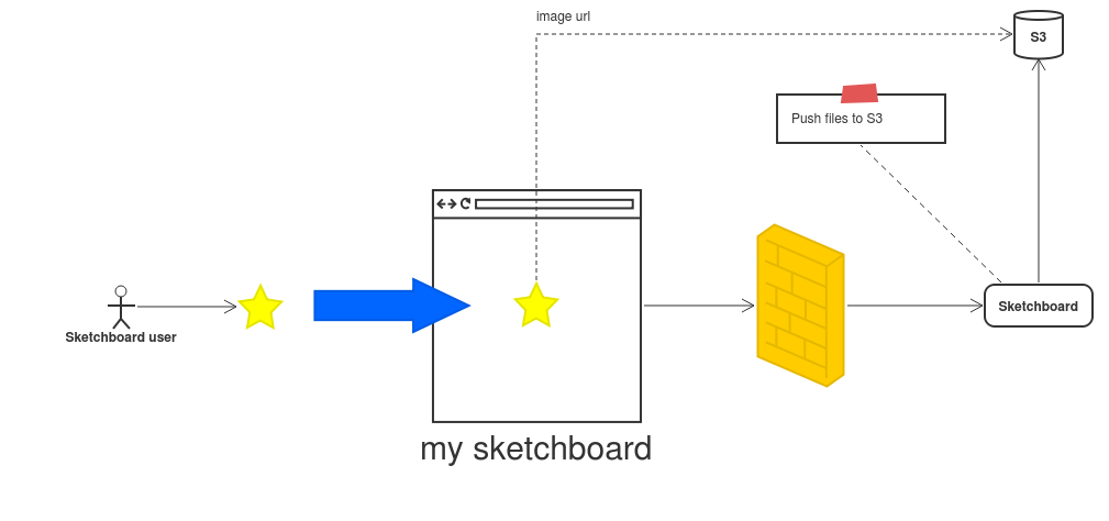
Use ready made cloud or firewall shapes. Separate elements clearly from each other.
Mobile app user interface
This is the first step to provide more support for users that sketch user interfaces. There are now mobile phone and web browser shapes available. Move e.g. mobile phone to background and place elements on top of that.
